Case study · Signos · 2022–present
Signos Health*
Brand and product redesign for the first FDA-cleared glucose system for weight management. Four years as the design function, from sole visual designer to art director.
I drove design on the rebrand from positioning to expression to campaign creative, and wrote the framework that made our existing brand system the context AI tools start from.
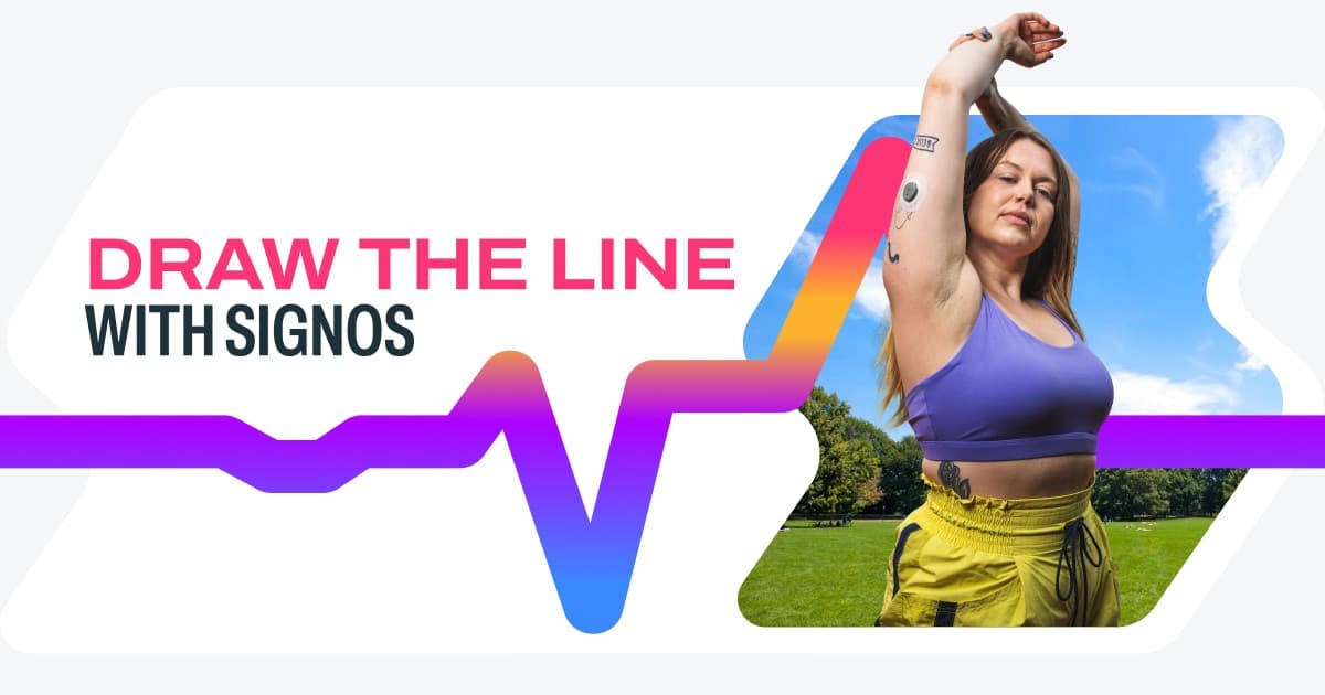
A smart friend with a degree in physiology
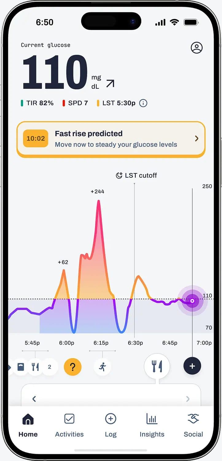
The category defaults to white coats and test tubes. Our customer is not looking for a clinic. The brand had to earn medical credibility without ever feeling clinical, then hold that voice from an in-app glucose curve to a billboard.
Maverick
Say the true thing, even when the category is whispering. Food is personal. Glucose is data. The brand is allowed to have a point of view.
Sage
A smart friend who happens to have a degree in physiology. Credibility without the white coat. Clarity without talking down.
Missionary
The work has to help someone change a day, not just decorate a funnel. Every surface, from a sticker to an in-app moment, is in service of that.
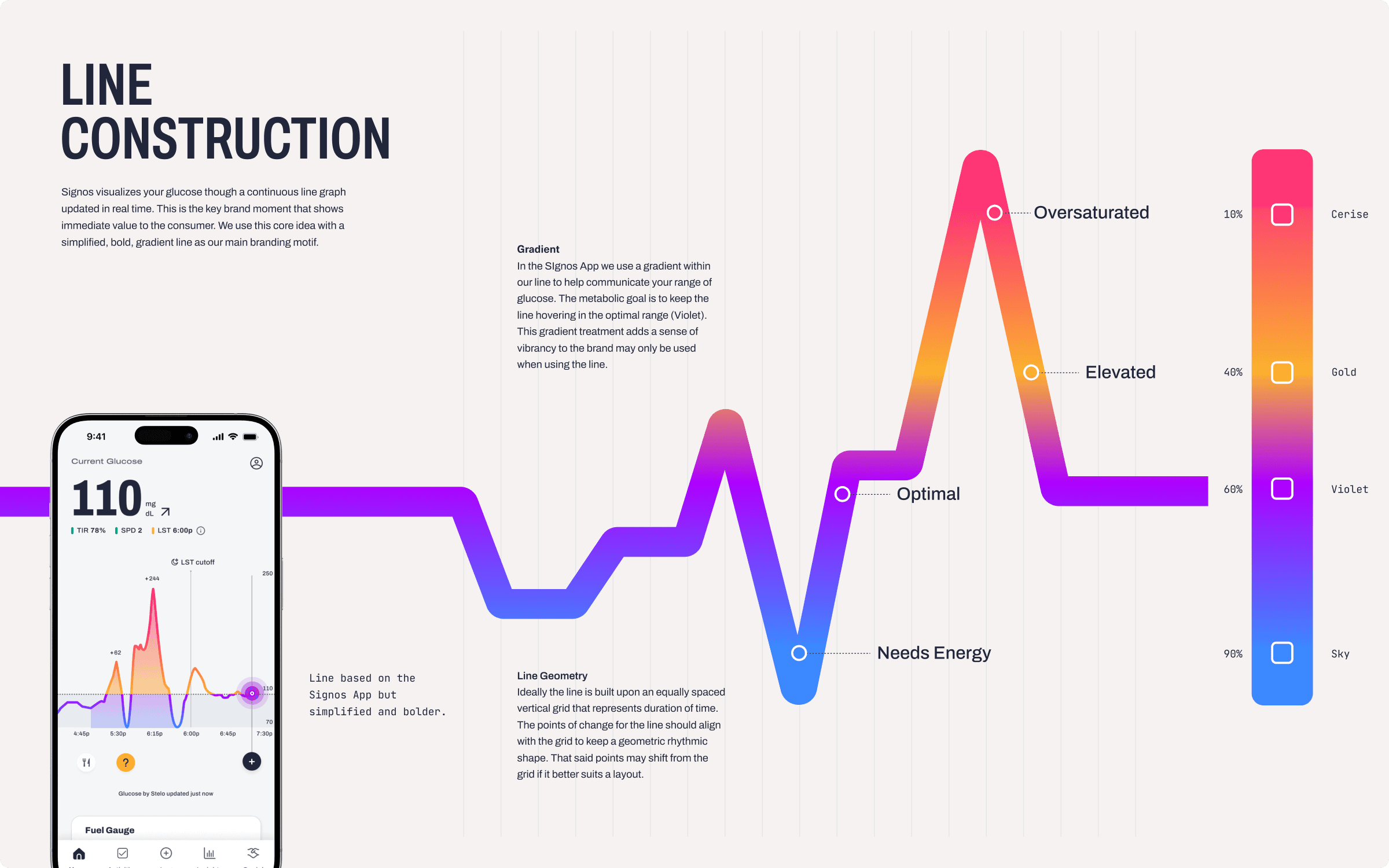
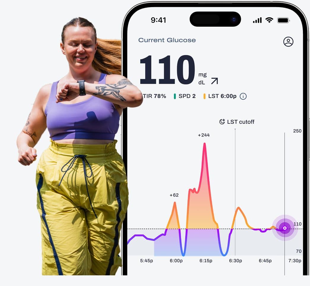
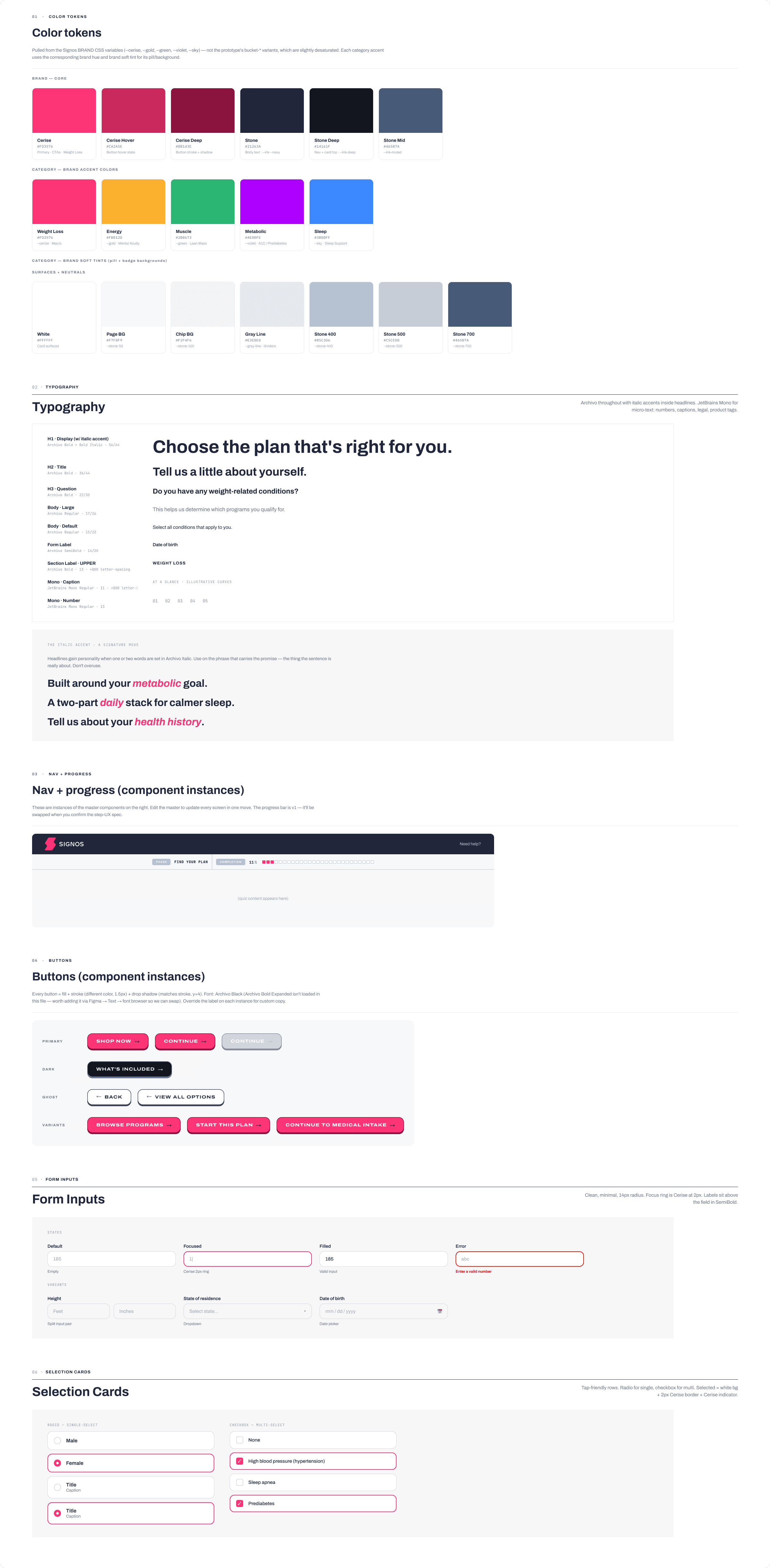
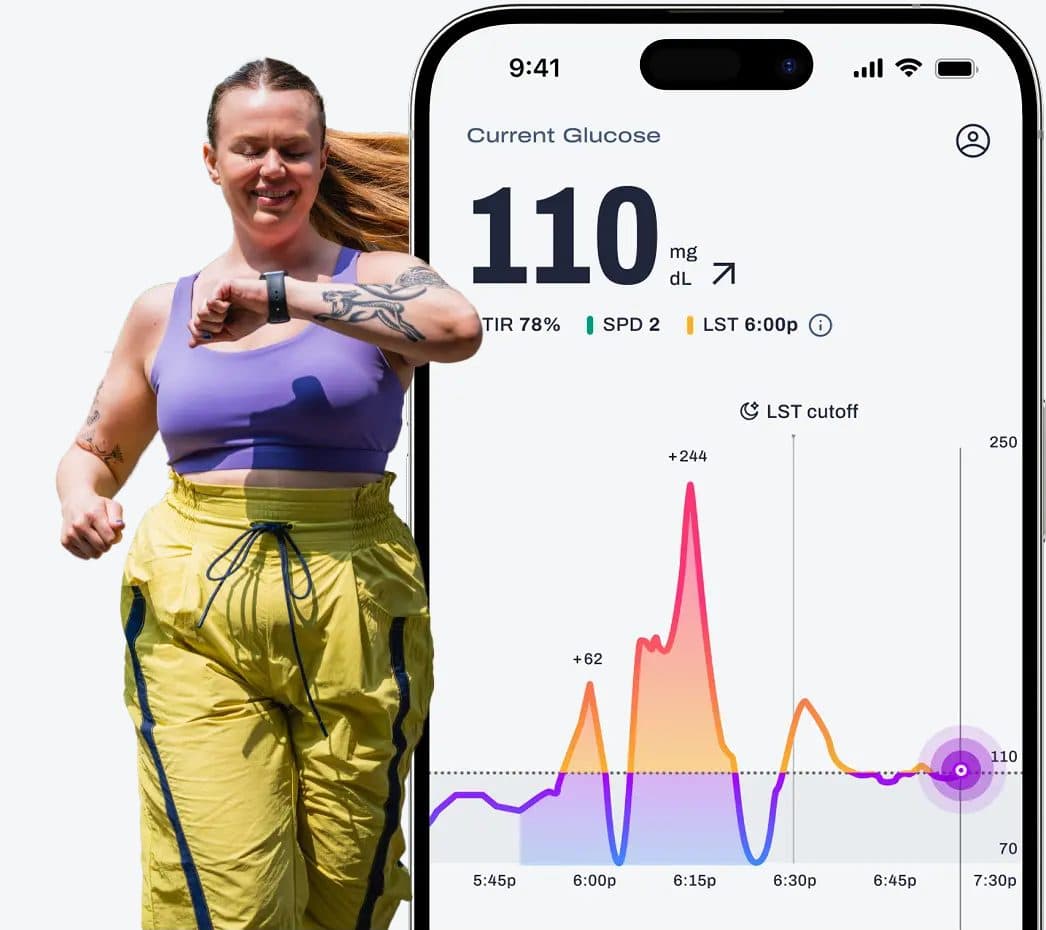
Colour is physiology. The line runs hot and cold. Cerise is always a positive action, a CTA, a high you can do something with, never a warning, never a no. Gold is oversaturated. Violet is resting. Sky needs energy. Green is lean mass.
Cerise
#FD3576
Primary. CTAs. Always positive, never negative.
Gold
#FBB12D
Oversaturated. The line running hot.
Violet
#AE00FE
Resting. The line in range.
Sky
#3B88FF
Needs energy. The line running cold.
Green
#2BB673
Lean mass. Progress that holds.
Sole visual designer, then art director
Senior Visual Designer from February 2022, Art Director from February 2025. Partnered with the VP of Design, marketing leadership, and product. The job was the whole expression, not a lane inside it.
Brand
Positioning into expression: pillars, voice, type, color, and a system that could travel from an FDA-cleared product to a Times Square board without splitting in two.
Product & site
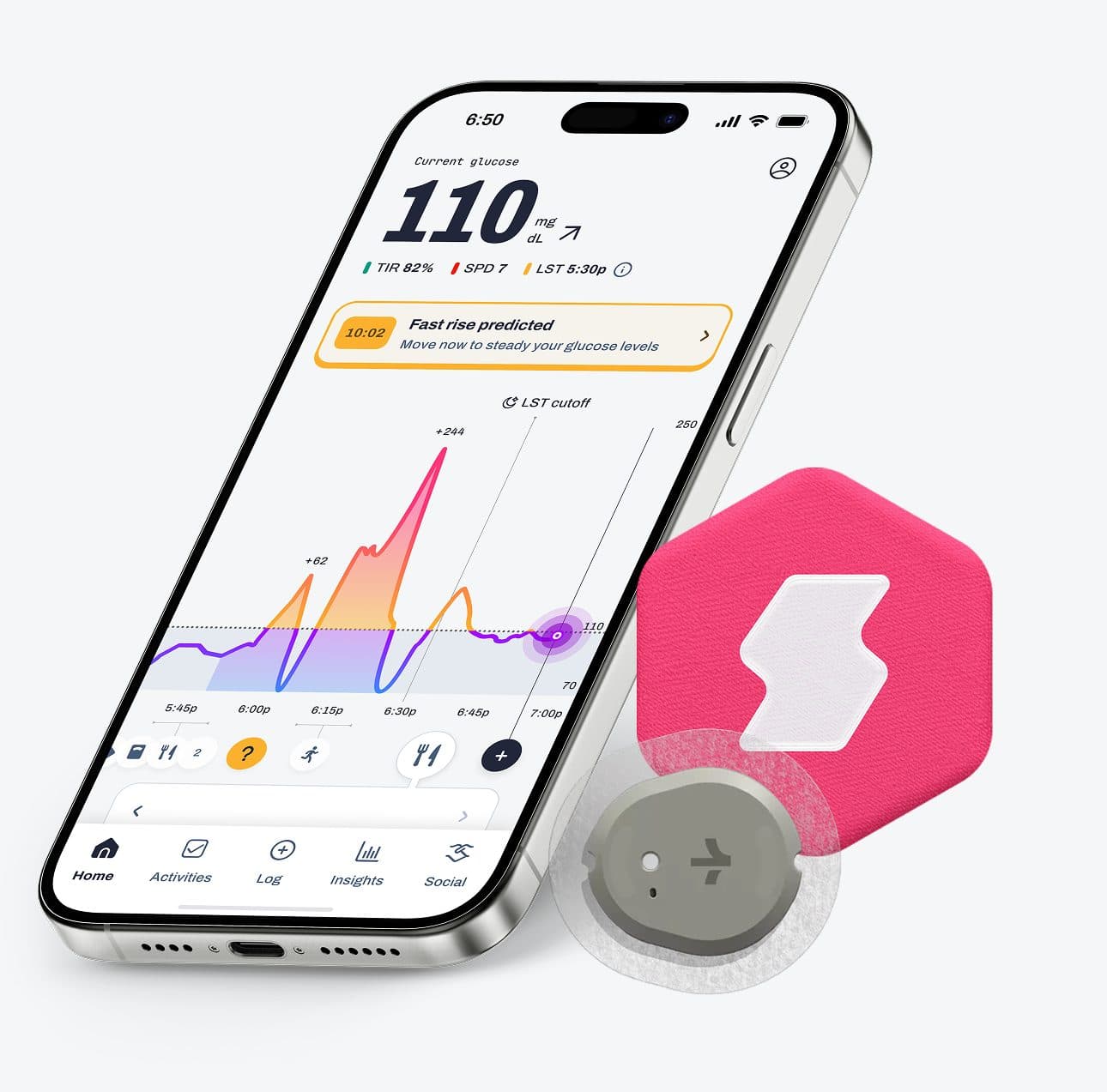
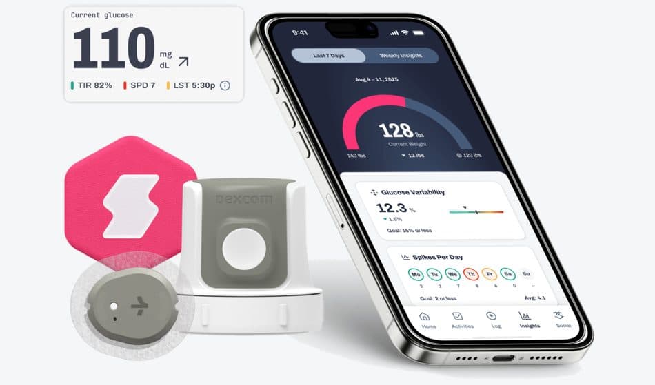
The rebuilt marketing site as the first surface customers met, and the in-app experience where brand and product meet, working with our UI/UX designer on onboarding, the glucose curve, and the moments that mark progress.
Campaigns & systems
Shoots, OOH, stickers, lifecycle email, paid creative, partner work, and the AI context layer that keeps generated output on-brand. Design review stays a required gate.
One system, every surface
App, marketing site, lifecycle email, paid, social, and press now trace back to the same three pillars and the same color discipline. A tweak to a card can ship to the site and to email at the same time.
Taste at the volume the algorithms want
The 2026 GLP-1 launch, hero, ad concepts, image library, ran out of the same parts as the rest of the brand. AI does the volume. Design review does the choosing.
Hold the mandate. Spend it on a system.
Brand advisor Andy Cunningham’s mandate was differentiation you can feel in a second and still trust in a medical context. I translated that into type, color, and rules a small team could actually ship against, not a poster that died in a deck.
01
Clinic by default
The category looks like white coats and test tubes. Sound medical without ever feeling clinical.
02
Warmth without soft-focus
A consumer brand still has to hold inside an FDA-cleared product. Friendliness that cannot survive a glucose graph is decoration.
03
Five surfaces, five voices
App, site, email, paid, press had been built quickly and built separately. A rebrand that only dressed the homepage would fail in a week.
04
Range that breaks the system
Times Square, stickers, a food fight, a two-pager. If the brand only worked in one register, it was not a system.
05
Speed that drifts
A small team, a launch week, and later an AI layer. Without rules upstream of production, volume becomes a different brand every Tuesday.
Archivo, extra-condensed through expanded. JetBrains Mono for data, labels, and numerals. Stone (#21263A) instead of black.
Colour as physiology
The glucose line already had a job. I gave the palette the same job. Cerise is a CTA and a high. Violet is rest. Sky needs energy. Gold is oversaturated. Green is lean mass. Color is not decoration. It is a reading of the body.
One primary, everywhere
A single CTA color across product and marketing, rather than a brand palette and a UI palette. The funnel feels like one continuous experience, and reviews stop stalling on “is this our brand or our product.”
June, then November.
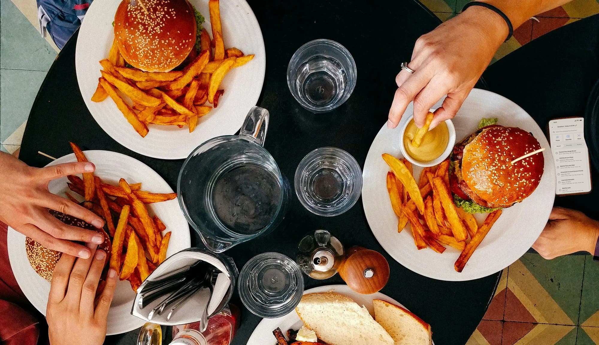
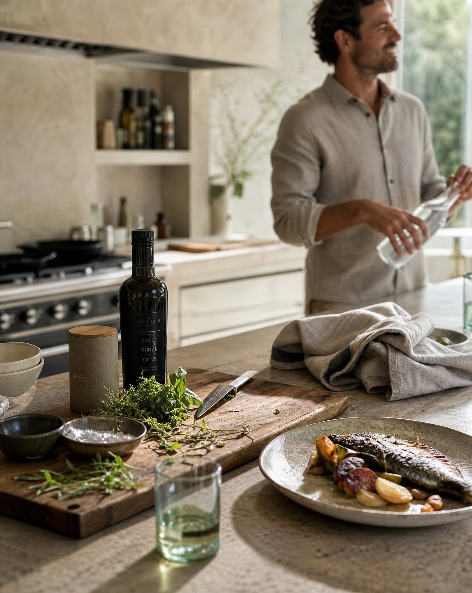
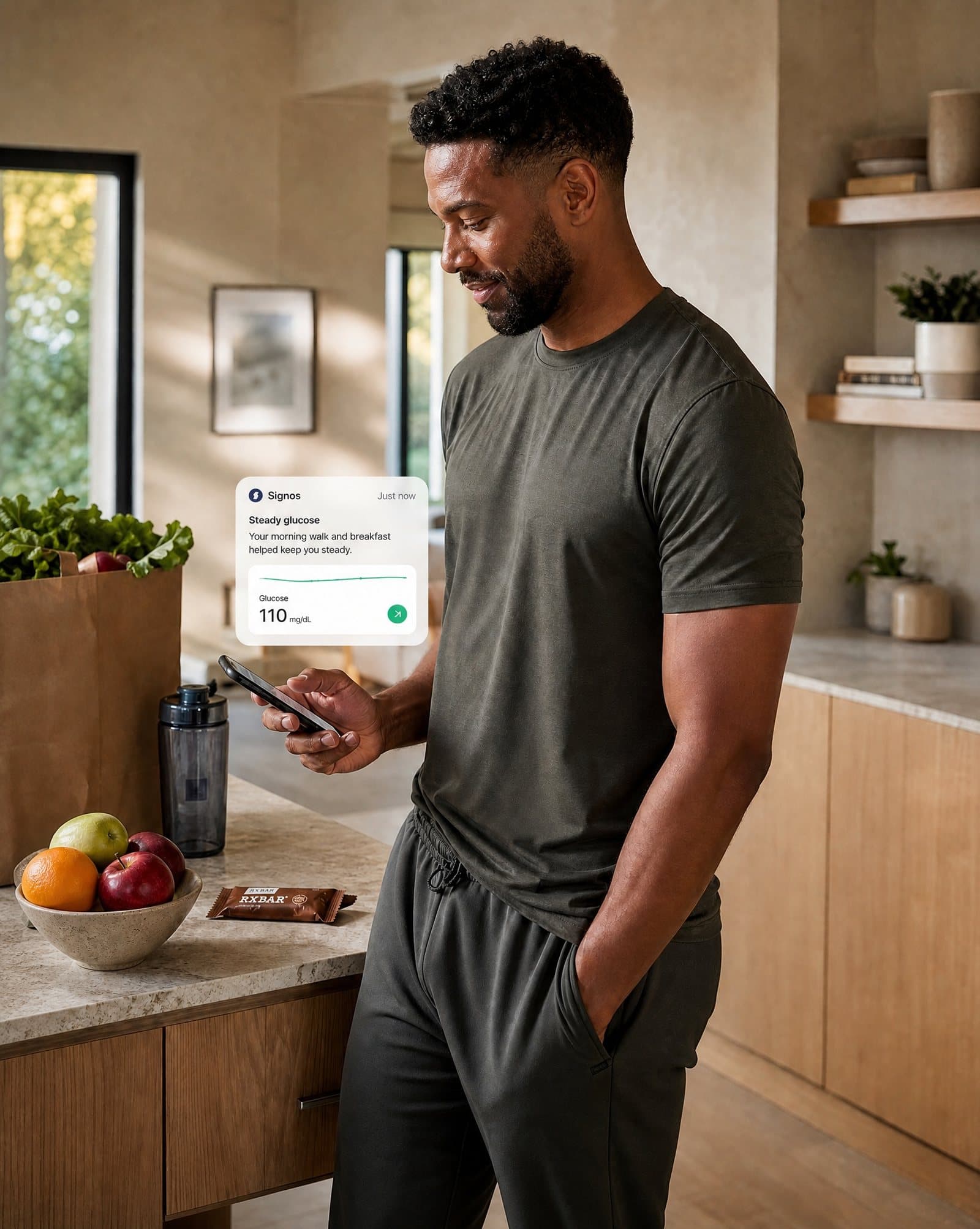
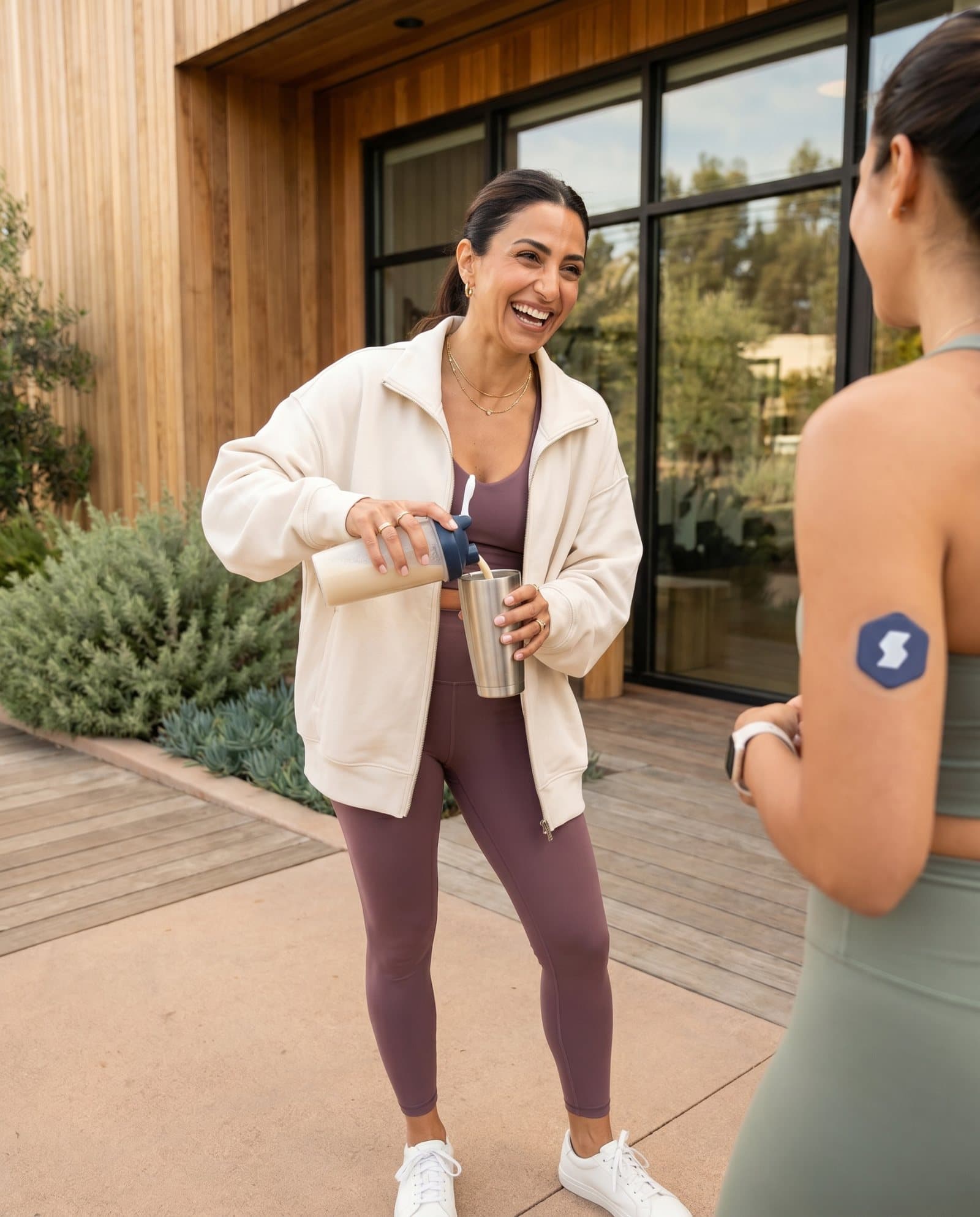
Two productions, five months apart. June 2025 was appetite and refusal: Food Fight and DON'T WANT. November was the lookbook: kitchen, table, the brand at home in real rooms. Same system. Different temperature.

Estimated
The number we walked into the room with. Two shoots, a year apart, same production discipline.
Final
The useful comparison is not a hero number. It is whether the second shoot inherited the first, or started over.
Times Square to a sticker on a pole
January 2023, Times Square. Later, guerilla stickers. In between, campaign work that went after the GLP-1 cultural moment on the brand’s terms, then merchandising for the program itself. If it only worked at one scale, it was a campaign, not a system.

A10Guerilla stickers. The same condensed voice, built to survive a lamp post.
The queue is the craft
In the launch week of August 2025 we shipped a new product, a rebuilt site, a new app interface, and a refreshed brand on the same week. That only works if the work is a queue of named jobs, not a pile of one-offs.
- 01BrandPillars, type, color, voice guide
- 02SiteShared components, launch surfaces
- 03AppCurve, onboarding, progress moments
- 04EmailIterable-ready slots, fallback fonts
- 05PaidVariant volume from the same parts
- 06ReviewDesign gate before anything ships
Named slots
Header, hero, product card, CTA, footer. A send is an assembly job, not a new design. The same slots live on the site, so a fix improves both.
A queue, not a pile
Work enters as a surface and a job, not as “can you make this pop.” The queue is how a sole designer, then an art director, keeps craft from becoming a bottleneck.
Rules upstream
Brand guide, voice guide, mobile system, email library. AI does not get to start from a blank chat. It starts from this.
If it fails over to Arial, it still has to be us
Email was the highest-volume customer touchpoint. Before the system, every send was a one-off. I built a modular library that shares components with the marketing site (header, footer, hero, product card, CTA) so marketing can assemble sends in Iterable without a designer in the loop, and a card fix improves both surfaces.
Primary · Archivo
Draw the line.
Variable width. ExtraCondensed for display, Regular for reading, Expanded when the line needs to breathe.
Fallback 1 · Helvetica Neue, Helvetica, Arial
Draw the line.
Email clients that will not load webfonts. Weight and tracking do the work Archivo’s width axis cannot.
Fallback 2 · Arial, sans-serif
Draw the line.
The honest last stop. If it still reads as Signos here, the system is doing its job.
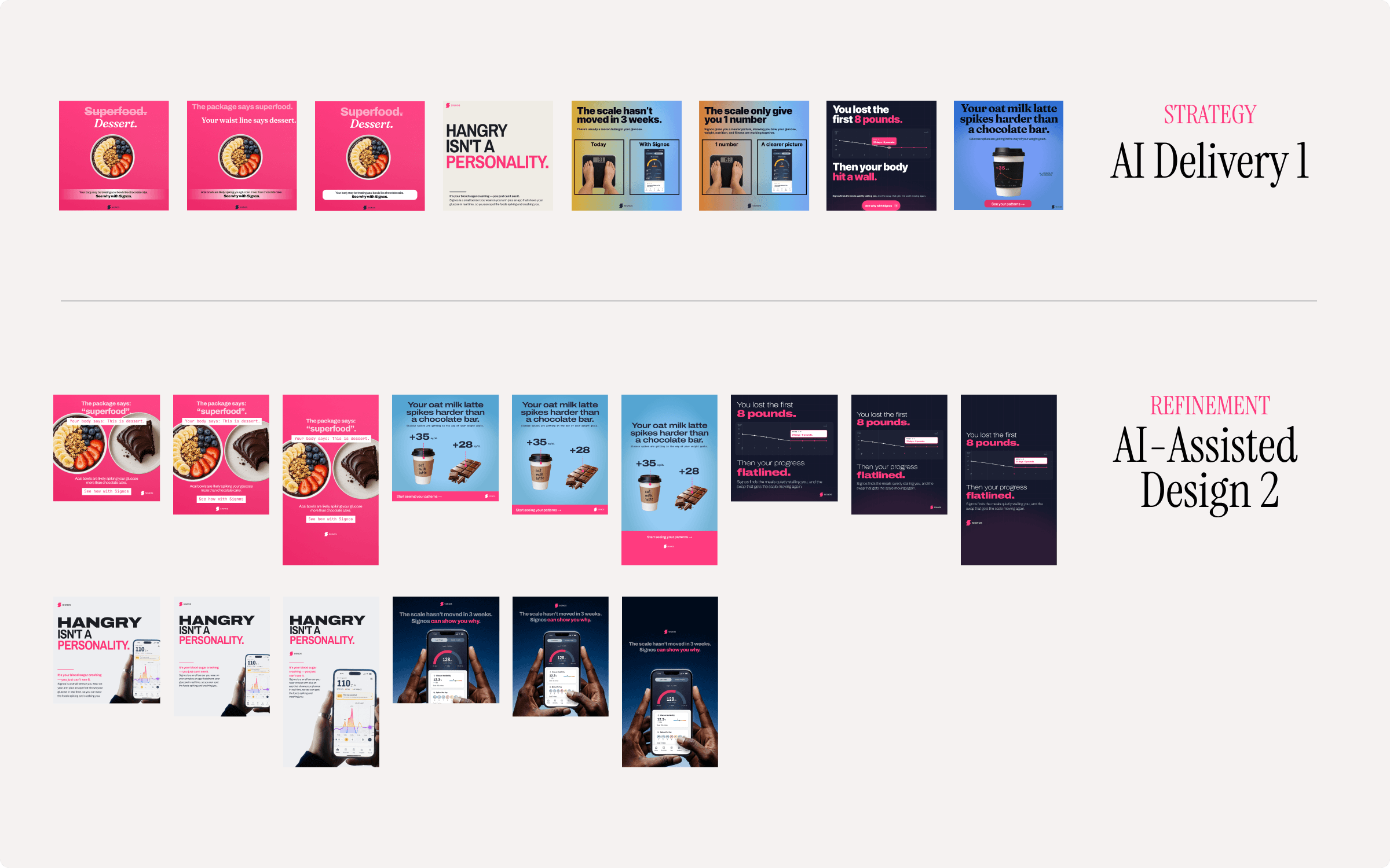
Everyone was already using AI. None of it looked like Signos.
Engineers in Cursor, marketing in ChatGPT, contractors wherever they liked. We already had the answer: a brand guide, a voice guide, a mobile design system, a brand library, an email component library. What was missing was the instruction to load them first.
Load the system
Brand guide, voice guide, mobile design system, brand library, email component library. The instruction is to start here, not from a blank prompt.
Generate inside the rails
Ideation, comps, and variance. The templates and the rules sit upstream of the generation, not downstream of it.
Design review
A required gate. AI is a leverage layer for taste, not a replacement for it. The curation is mine. The volume is what I delegate.
Merchandising the thing the culture already knew
The campaign work had already been in the GLP-1 conversation. Then the offer had to sit in the same system: vial renders, membership cards, partner pages. Pricing on this page stays in the placeholder state. The design problem was the object, not the number.
CGM membership
From $000
Signos+ GLP-1
From $000
Essentials
From $000
Who held what
Role
- Senior Visual Designer, Feb 2022 – Feb 2025
- Art Director, Feb 2025 – present
- Brand expression, campaign creative, email system, AI context framework
Collaboration
- VP of Design
- UI/UX design on in-app surfaces
- Marketing leadership and product
- Photography and production partners on campaign shoots
System
- Archivo · ExtraCondensed to Expanded
- JetBrains Mono · data, labels, numerals
- Stone instead of black
- Cerise as the only primary CTA