Case Study · Cholula Hot Sauce
Cholula Hot Sauce*
Three years as lead designer on Uncap Real Flavor, national TV, chalk-on-slate print, and a visual system that scaled across every channel
Campaigns · Art Direction · Print · Video
At Spitball Advertising, I grew into the lead designer role on the agency's biggest accounts. Cholula was the one I returned to for three consecutive years. I developed the chalk-on-slate visual system, drew every flavor illustration from scratch, and art-directed the national TV spot, print, social, broadcast, and in-store, all anchored by the same handmade aesthetic.
The brief
Cholula needed to compete against larger hot sauce brands with bigger budgets. The brief was to lean into authenticity and craft, a brand that looked handmade and warm, not manufactured. The visual language had to travel across everything from in-store displays to 30-second TV spots without losing the feeling.
01 Print system
The chalk-on-slate visual language and illustration library
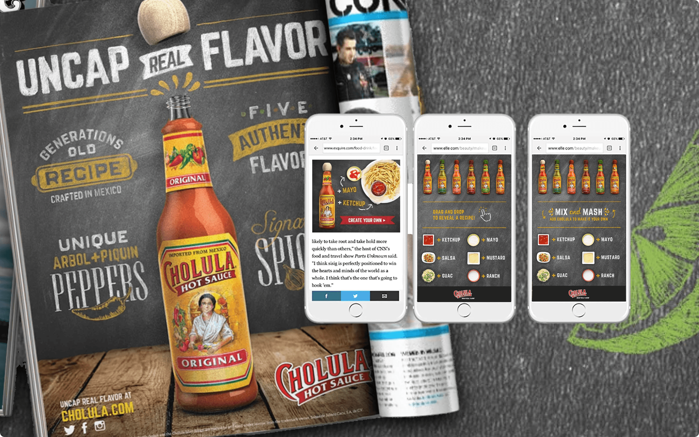
I developed the chalk-on-slate visual system, hand-rendered typography, textured surfaces, real food photography with a deliberate, artisan aesthetic. Every flavor illustration in the system is one I digitally drew from scratch: each ingredient, each pairing, each SKU. As the illustration library grew, I built an asset library for agencies to download illustrations as I produced them and managed it for two years, so any agency in the Cholula ecosystem could pull the right asset without starting from scratch.
02 Digital and social
The platform extended to every channel
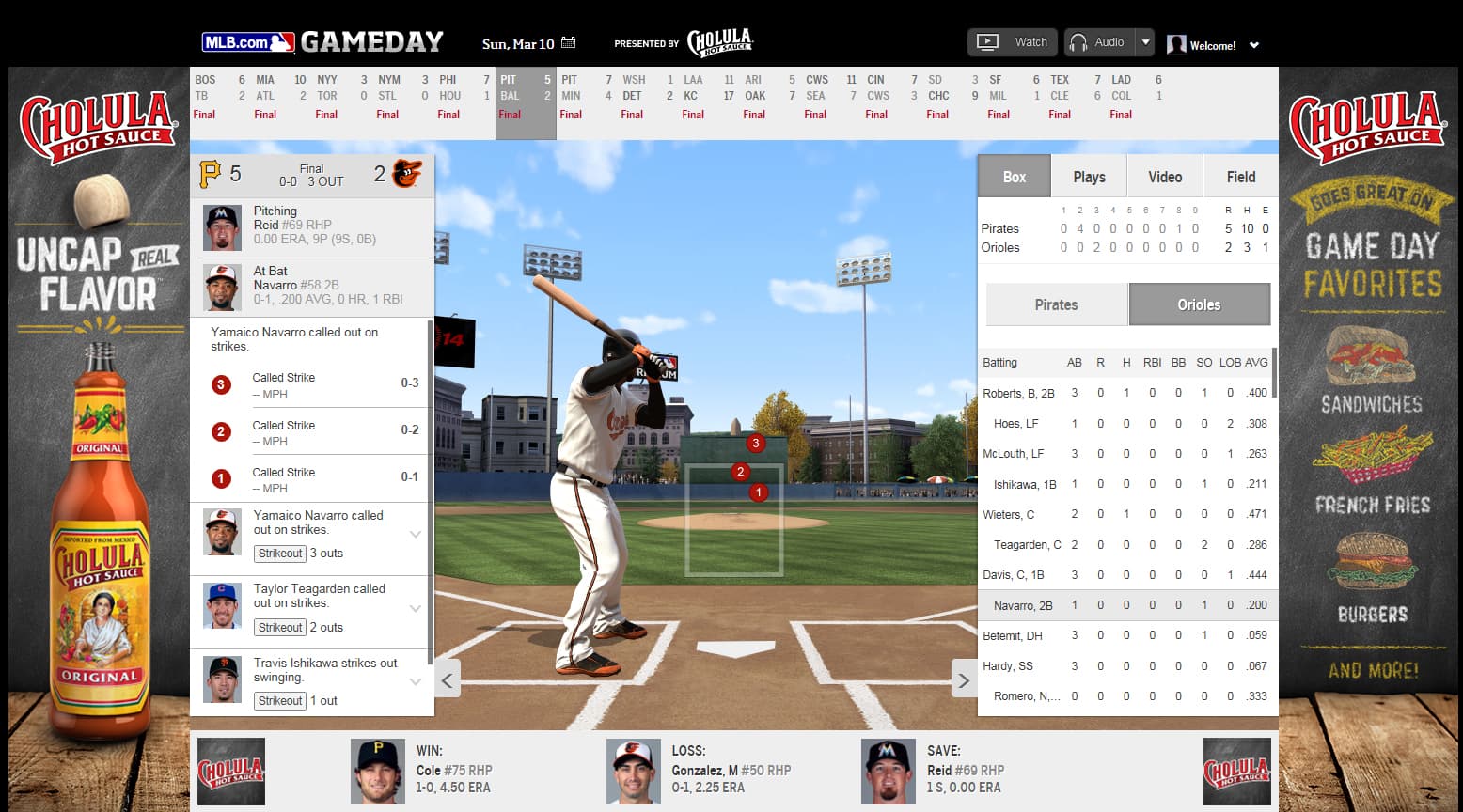
The visual system extended into social, digital, OOH, and promotional activations. MLB Gameday tie-ins, drag-and-drop interactive social executions, and platform-native social formats all inherited from the same chalk-on-slate foundation. Consistency across channels was the discipline.
03 TV broadcast
Art directing the national commercial
The national TV commercial brought the aesthetic into motion. I art-directed the visual treatment: camera work, surface textures, typography integration, color grading. The spot ran across broadcast and was extended into social and digital cuts. Print ads ran alongside, same chalk-on-slate system, real quotes from real Cholula fans. The campaign was estimated to lift brand awareness 12% and generate $14M in earned media.
Reflection
Three years on the same platform is rare in agency work. It meant the system had to grow, not just repeat. Each year we pushed the visual language a little further while protecting what made it distinctive. Learning to evolve a campaign without breaking it is a discipline I've used in every brand system job since.
Video
Cholula Uncap Real Flavor, Commercial 1
Cholula Uncap Real Flavor, Commercial 2