Femme Fight Club
A brand and design system for women who train like fighters and show up like a whole mood
Case Study · Femme Fight Club
Soft heart. Hard hooks. A visual system built for women who train like fighters.
Femme Fight Club lives in the tension between two things people are told to pick one of: being tough and being pretty. I built the brand foundation — mark, palette, type, components, and voice — so pink isn't the opposite of powerful. It's the flag.
Brand Identity · Design System
Project overview
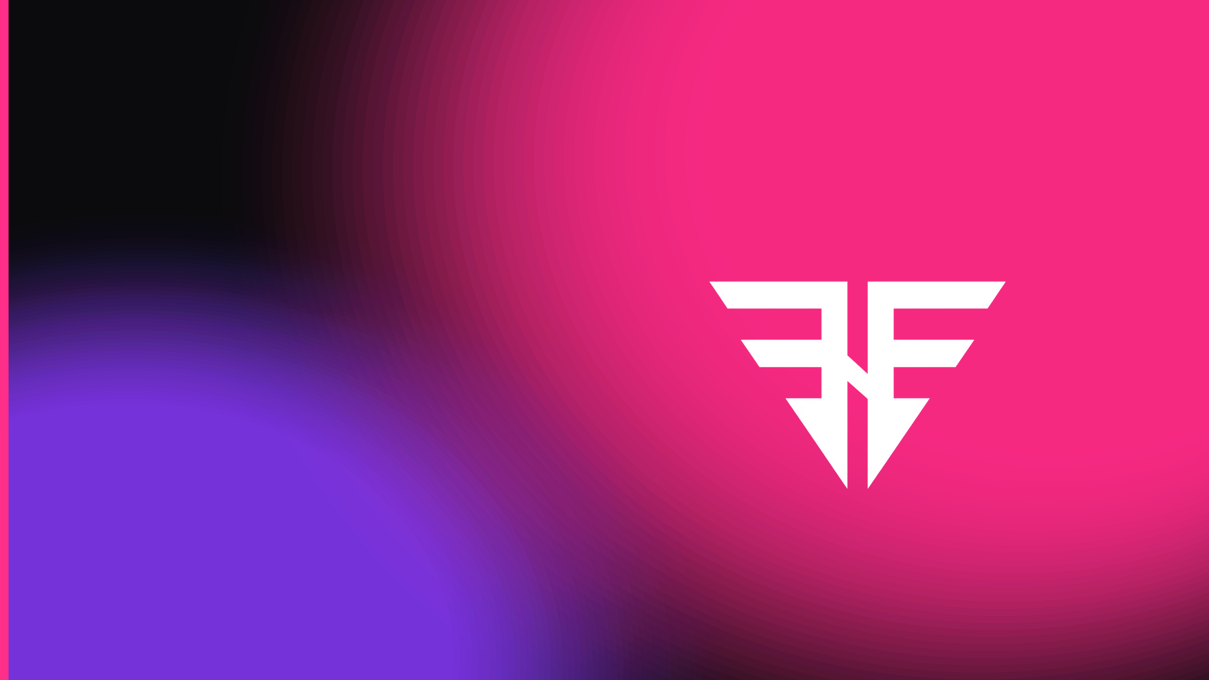
Femme Fight Club is a brand for women in real combat training — boxing, Muay Thai, BJJ, and beyond — with zero apology for looking good doing it. The brief was to build a full design system from the ground up: a mark that reads as both protective and aggressive, a color language led by knockout pink and charged with electric discipline hues, typography with athletic impact, and a component kit that flexes from merch to class schedules to member UI.
The problem
Combat sports branding defaults to either drill-sergeant black-and-red or pastel "fitness for her" that talks down to its audience. Femme Fight Club needed a third lane: fierce and cute in the same breath. The system had to hold across apparel, social, class schedules, and digital product without collapsing into a boys' club with a coat of paint — or a wellness brand that forgot the fight.
What I did
Essence & duality
Mission, personality, and the soft/hard tension
The brand refuses the choice between tough and pretty. Mission: train fierce — a home for real combat training with zero apology for looking good doing it. Personality: bold, playful, a little cheeky — hit hard and wink. Promise: all yours — every style, every body, every vibe, with color that flexes so no one has to fit a single mold.
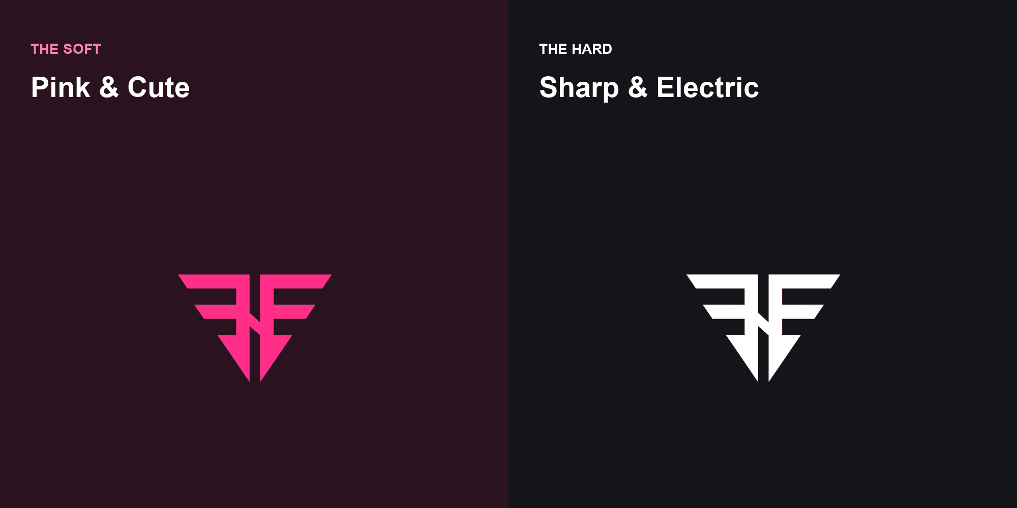
That duality became the structural spine of the system. The Soft is bubblegum, hearts, gloss energy. The Hard is stark white on ink, angular cuts from the mark, and high-voltage accents. Every surface picks a side of that tension on purpose — never a muddy middle.
The mark
FF monogram as winged crest and blade
The FF monogram doubles as a winged crest and a downward blade — protective and aggressive at once. It's the anchor of the whole system. Approved versions run white on dark, ink on light or pink, and pink as accent. Clearspace equals the height of one F arm; minimum size stays large enough that the inner cuts stay crisp.
The collegiate "Property Of" lockup became the merch and membership hero — varsity condensed type stacked over the mark. Rules are strict on purpose: no gradients on the mark, no shadows, no stretch, no busy backgrounds with poor contrast.
Color & discipline spectrum
Knockout pink leads; electric hues tag the fight styles
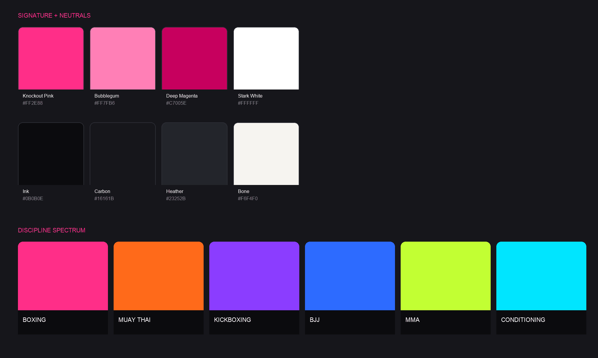
The palette is anchored by Knockout Pink (#FF2E88), built on stark white and ink, and charged with electric brights — no earthy, no muddy. Pink leads CTAs and brand moments. Bubblegum and deep magenta handle soft highlights and pressed states. Neutrals run ink, carbon, heather, and bone.
Each fight style owns a color so classes, schedules, and merch drops read at a glance: Boxing pink, Muay Thai volt orange, Kickboxing violet, BJJ electric blue, MMA acid lime, Conditioning cyan. Wide variety on purpose — never blended into a rainbow soup.
Type, components & voice
Oswald impact, Inter workhorse, JetBrains labels
Typography is two voices plus a label: Oswald for athletic display (uppercase, condensed for schedules and the Property Of lockup), Inter for body and product copy, JetBrains Mono for eyebrows, hex codes, member IDs, and schedule tokens. Impact comes from scale and color — not from stacking fonts.
The UI kit is rounded and friendly where it's cute, angular and cut where it's fierce. Pink drives primary action. Components cover buttons, tags, form fields, and class cards. Voice rules sit alongside the visual system: show up / throw down, hooks & heels, your style / your color — never drill-sergeant yelling, never condescending to pink, never corporate wellness jargon.
Outcome
Design System v1.0 ships as a token-driven kit — pink, ink, the six discipline hues, and two type families — so swapping a token moves the whole system. The mark, color, and type hold together across merch, social, membership, and class schedules: soft heart, hard hooks, built to flex without losing the fight.
Takeaways
Next project
Signos Health