Case Study · Castle Foods
Castle Foods Brand Identity*
A logo, type, and identity system for a heritage spice importer entering a new chapter
Brand Identity
Castle Foods is an importer, processor, and purveyor of spices, a B2B wholesale supplier serving foodservice clients since 1948. Spitball brought me on to lead design on the brand identity: logo, type, color, packaging direction, and a system built to scale across a wide product line. The system is still in use today.
Project overview
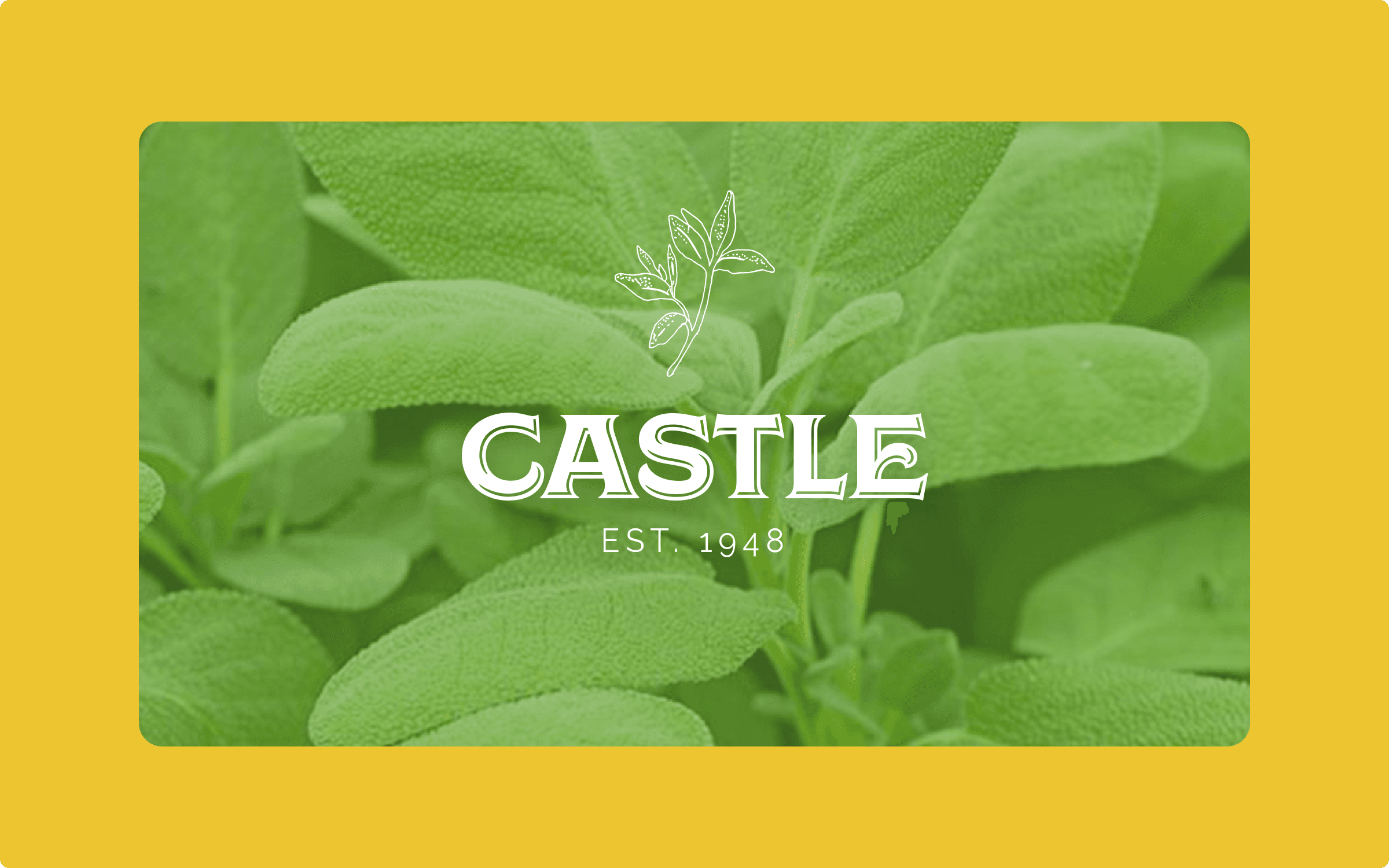
Castle Foods is an importer, processor, and purveyor of spices, a subsidiary of Kalustyan Corporation, sourcing and supplying herbs, spices, and seasonings to foodservice and wholesale clients since 1948. Spitball brought me on to lead the brand identity: logo, type, color, packaging direction, and a system built to scale across a wide product line. The goal was a brand that felt confident and considered to B2B buyers, heritage without stiffness, and a system that could absorb new SKUs without a rebuild every time the catalog grew.
The problem
The existing brand wasn't keeping pace with the quality of the product or the expectations of the buyers Castle was trying to reach. Every new SKU risked becoming a one-off design exercise. They needed a premium, intentional presence on the shelf and a repeatable system behind it.
01 Logo and wordmark
The primary mark, lockups, and variations
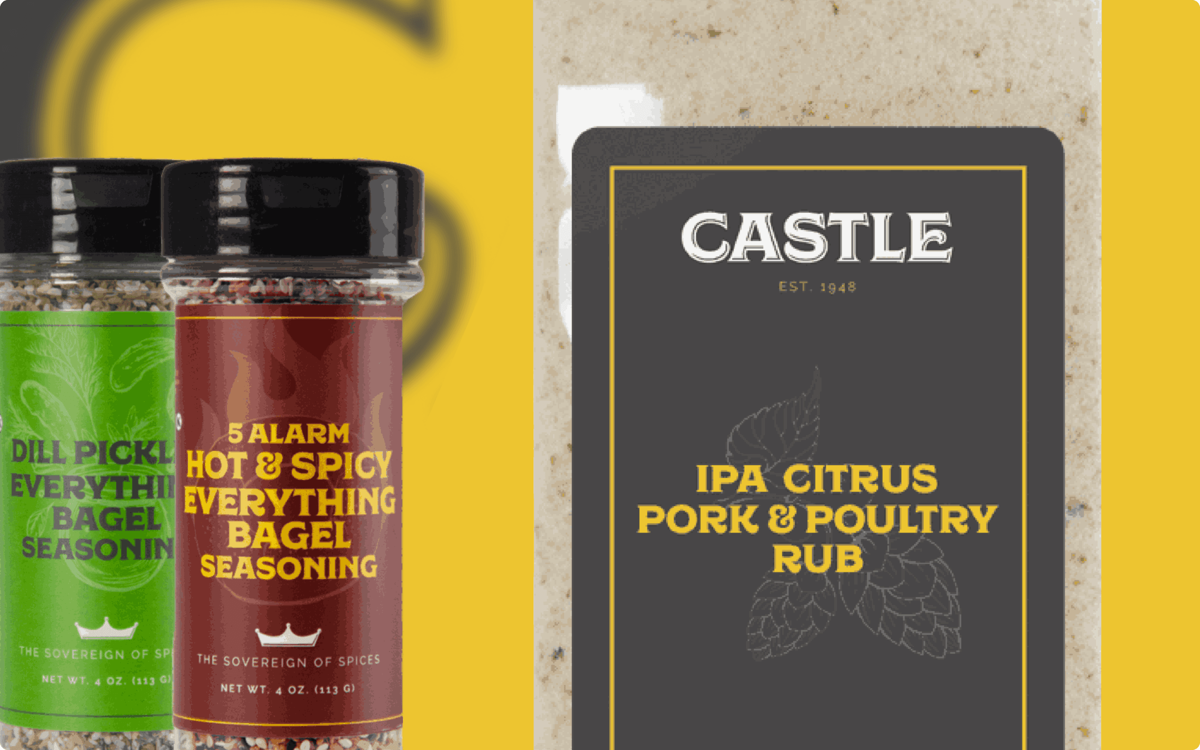
The wordmark is a quiet custom serif font with a memorable "C" so it feels grounded on the shelf and strong as an independent mark on packaging and social media. A small crown mark anchors the brand's heritage line, "The Sovereign of Spices", which became the secondary signature beneath the wordmark. Lockups handle every common application: vertical, horizontal, mark-only, and small-scale. Variations cover the SKU lineup without ever requiring a redraw.
02 Type and color system
Hierarchy, palette, and a single accent
Color is muted earth tones, black, ivory, and a single warm gold that carries the line. Typography hierarchy is generous and direct so a customer can read the spice name from a step away. The accent gold is the only place the brand allows itself to get loud, and that restraint is what makes it feel premium next to the noisier shelf neighbors.
03 Design system
Components and rules that scale across SKUs
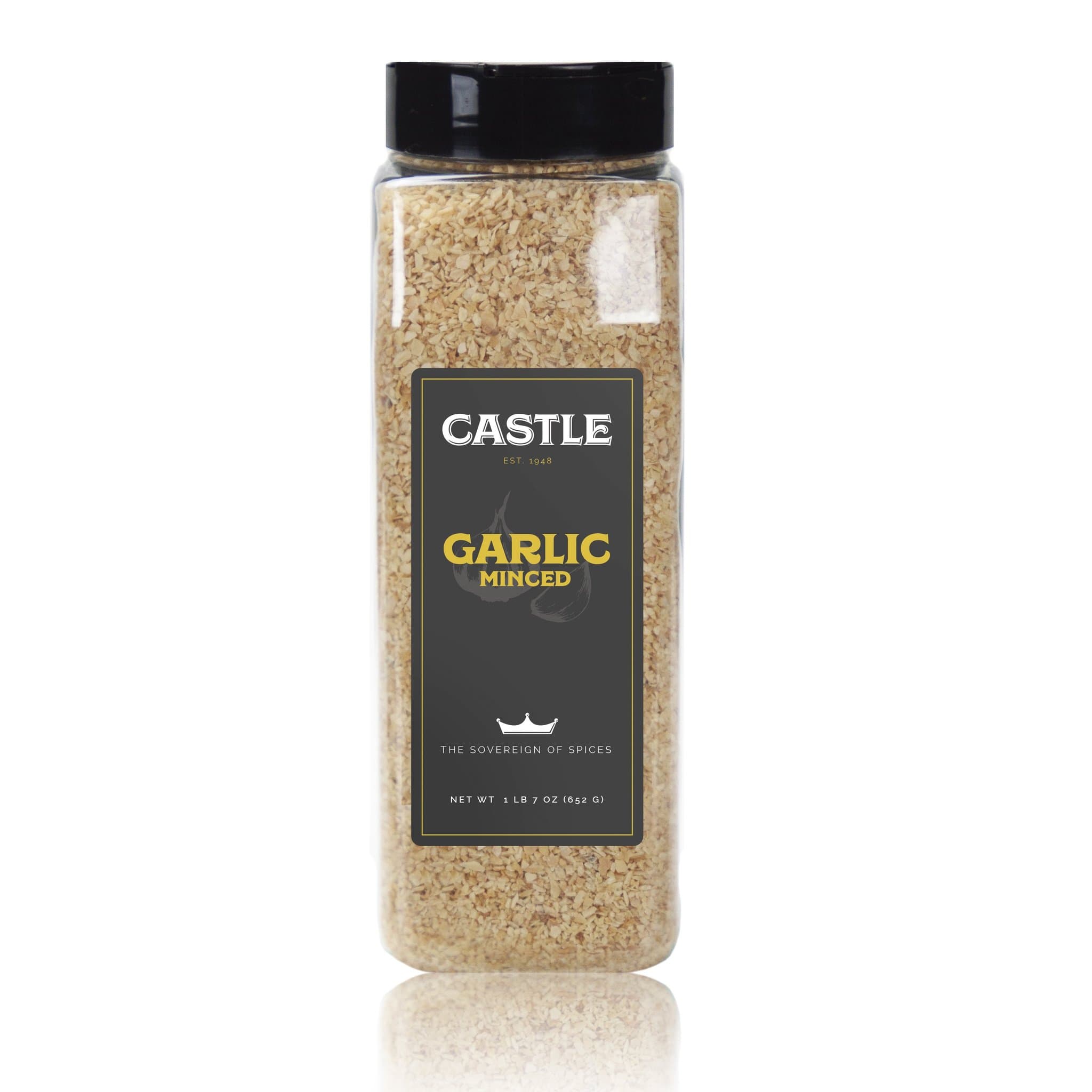
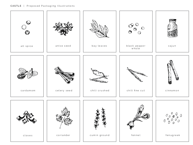
I built the system so adding a new SKU is a 10-minute job, not a 10-day one. Named slots, locked grid, defined photography rules, naming conventions. The brand expression scales without the brand having to rebuild from scratch each time a new product joins the line.
Replace with final asset
Outcome
The brand has a confident, quiet, modern presence that holds across every SKU and every channel. The system is still in use today, absorbing new products as the line has grown without needing a rebuild, exactly what a category-entrant brand needs in its first three years and beyond.